
Project Details
Role
UI/UX Designer
Tools
Figma
Timeline
July 2021 - August 2021
Applied Skills
Competitive Analysis, Ideation, Information Architecture, Journey Map, User Interviewing, User Research, Wire-Framing
The Problem
The idea for this app came to me while I was traveling solo in the early weeks of January 2021. It was a much needed trip after 2020: from supporting hotels through a global pandemic, UX|UI certification course, and everything else.
The one pain-point I experienced as a foodie on this trip was having to eat alone, which resulted in me shying away from restaurants I really wanted to try. This made me realize how other foodies may be in the same situation - leading me to design this app for foodies.
Research
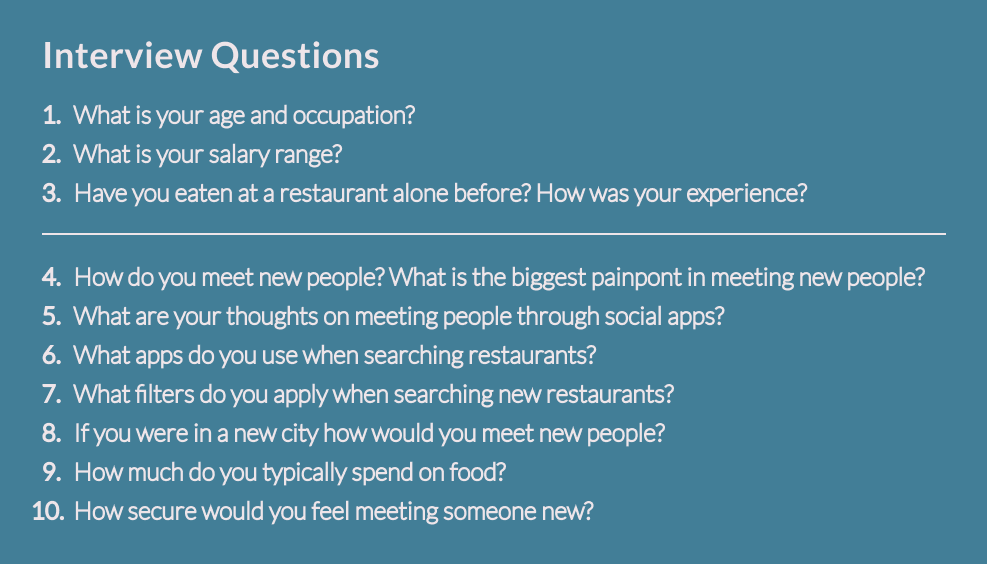
Interviews
For the interviews, I met with people of varying backgrounds, income, age, personality, etc - to understand how this social app will impact/influence their decision to eat with strangers.
What I learned from the interviews:
Background was not a factor which impacted the choice to eat alone or with others. People do not enjoy dining alone at a restaurant and would prefer to enjoy it with somebody.
Personality did not deter users from wanting to meet new people for food. If there is one thing that introverts and extroverts have in common it’s food.
Journey Map
Competitive Analysis
Competitive Analysis 1 - Open Table
Competitive Analysis 2 - Yelp
Competitive Analysis 3 - Meetup
Wireframes & Prototype
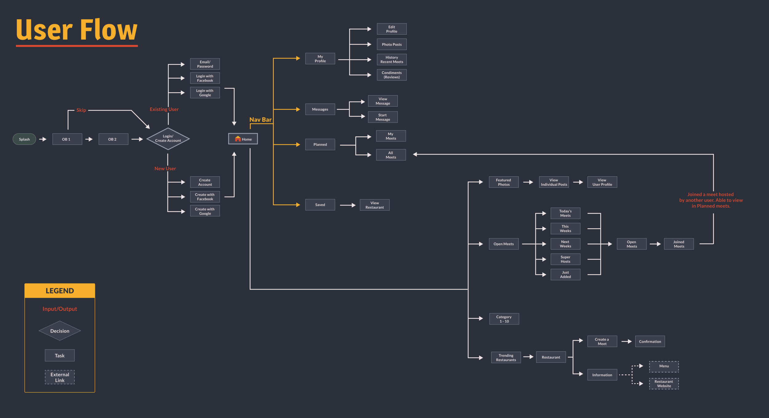
User Flow
Mid-Fidelity Wireframes
Mid Fidelity Wireframes
High Fidelity Wireframes
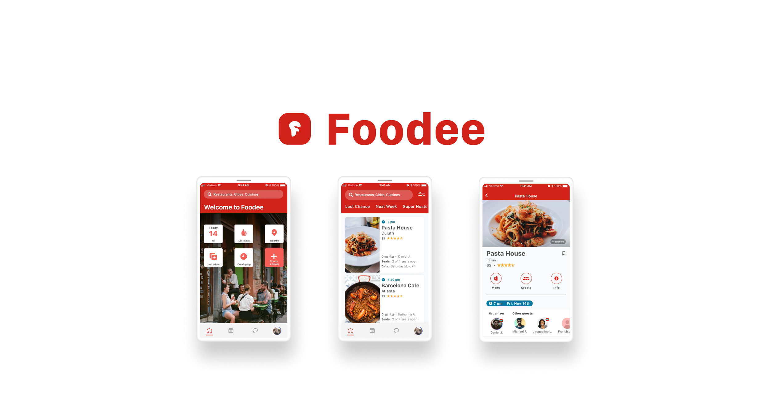
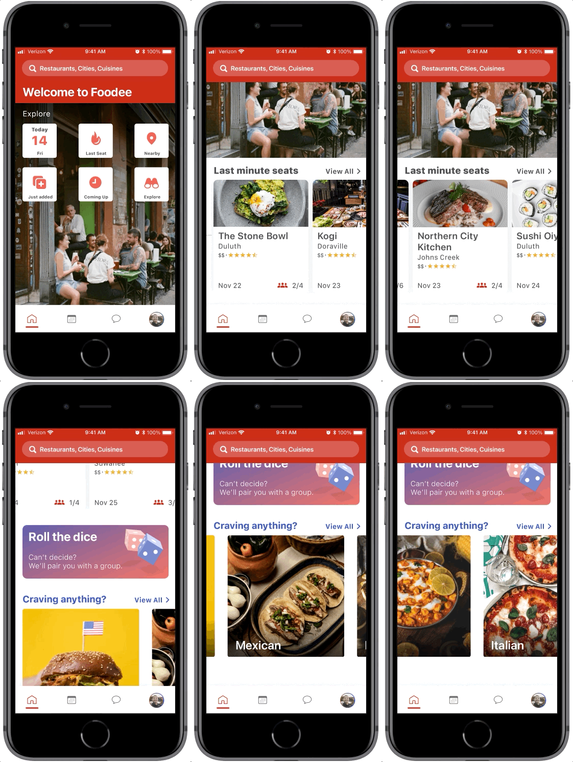
Redesigned HiFi Wireframes - After collecting feedback for the original design, most users were a fan of the dark themed branding. However, the dark tones did not drive users to think of a social food app as much as the red branding in the redesign has.
The redesign
Rebranded by jumping into color theory and understanding the psychology behind users associations with different colors
Improved the UX of the home screen to allow users to easily search for meetups and find recommendation/top picks
Revisited the information architecture to prioritize what the users focus needs and use for the product would be through results from the interviews.
Original HiFi Wireframes
Final thoughts…
This was an exciting idea that is still going through iterations to be refined. Looking back, I realize that a project of this scale requires more in depth research to understand the users’ needs and the features to bring forward to the users.
Whats next is continuing the iteration process through more research and testing, and breaking down some of the complex problems. Another goal would be to discover the needs of the users to prioritize and conceptualize new features to implement into the overall UX.


